Development
Work here is done to progress my abilities in any software
PlayStation Animation
In order to learn how to use trim paths and make shapes animate themselves I used the playstation button shapes for an animation
The first job was to make the shapes which is incredibly easy.
Using the shape tool (Q) I was able to make both the square and circle and then using the pen tool (G) I was able to draw the triangle and X. Using the pen tool actually requires you to create the shape by yourself instead of making a premade shape.
In order to animate each shape they all had to be on their own layer, including the X which has to be made using two overlaping disconected lines. In order to do that all I had to do was click on the layer after making the first line, then make the second.


In order to make the shapes uniform enough in scale, I turned on all of the guides and locked them into place.


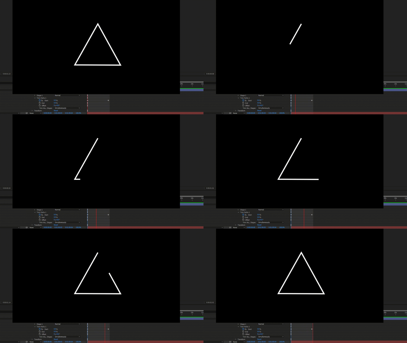
In order to get the trim paths effect I pressed the add button next to the layers and selected trim paths. Trim Paths gives the shape the ability to draw itself using the lines that I created. This is controlled by a set of start/end values and keyframes. By creating 2 start keyframes (the first at 0 then the second at 100) the shape will draw itself


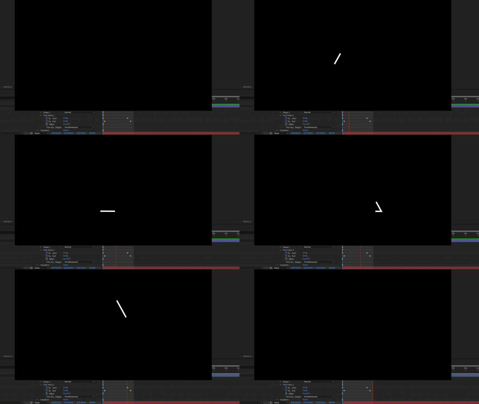
By creating 2 end value key frames and placing them just after each start key frame, the end of the shape will trail after the shape as it's being drawn creating a nice ghost outline style effect in my final piece I decided to use the effect as an overlay to the full shape instead of it being on it's own.

Seeing as there are 5 playstation consoles and 4 buttons, I decided to have each button themed after each console, then they'll all lead up to the climax of the PlayStation 5. I enforced this design by having the background replicate the consoles menus.

The backgrounds for the ps3 and ps4 (X and Square) where just MP4s from youtube but I actually designed the ps1 and especially the ps2 backgrounds.

The square background was an image I got of the playstation 1 background but higher quality.
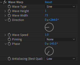
In order to not make it look so basic and bland I added a wave effect. This effect not only made it look like it was waving in the wind but it also gave it a nice sort of grainy feel on all of the lines.

I'm most proud of how I re-made the background for the PS2. The ps2 menu has glowing balls that float around the menu I wanted to recreate this for the backround of the circle.
My first step in recreating this was to create a circle once again using the shape tool. I filled the circle with a shade of blue commonly used for the ps2. I applied the glow effect which made it sort of translucent with a slight highlight which was a step in the right direction however it still wasn't right. I decided to add the effect Dimension - Glow + Shadow which i hadn't used before so I was experimenting with it for the first time. After making the shadow colours black and a light blue I started to get what I wanted, as one finishing touch I added the VR blur effect. I placed movement keyframes on the ball and started to create a path for it that bent around the screen. After this I copied the ball and pasted it 3 times, moving them slightly after one another to give a nice trail effect. It didn't look identical to the original but i think it was a fairly good adaptation.


The next two backgrounds where both video files of the ps3 and 4 menus so i didn't have to create anything like I did for the first two backgrounds. Once I had gone through all of the buttons I added a plain white background which represented the new sleek almost futuristic design of the PlayStation 5. In the background I placed a low opacity playstation logo as an overlay to make it feel linked to the background.

I found the Playstation font online from DaFont and used it to write both "PlayStation" and the tagline "Play Has No Limits" I wanted to animate this in so I decided to try trim paths on it like I did with the shapes just to see what it looked like. The text didn't draw how I thought it would, instead of drawing each letter like it would be by hand the text warps and wraps itself over the letters. Whilst this isn't what I wanted at all it looked really good and fit quite well so I kept it

Final Outcome

I was thinking of adding music to it but I couldn't think of how I'd be able to merge the different songs for each console so I decided to leave it without sound
When writing up my process I realised that I could have put a motion blur on the PlayStation 2 glowing balls so I tried that but it didn't really change much, It only made it slightly brighter


Overall I was actually quite happy with how this turned out, I think it looks good but I also just had a lot of fun creating this and trying out new techniques